Release 3.6.0
A few new release worthy improvements:
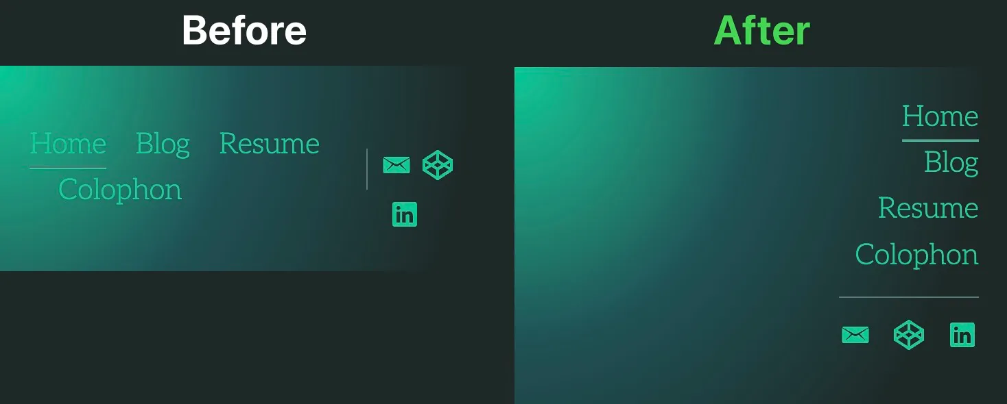
- Improved mobile header
- Skipnav and consistent focus link styles
- Variable fonts for flexibility and performance
- Improved contrast for a11y
Mobile header
Big improvements to the header on mobile. Now, the menu stacks to the right to allow for easier navigation on small screens. Thanks to this simpler layout I’m able to avoid loading yet another javascript file for a simple drawer menu. This also improves accessibility because the experience shows links to everyone.

Skipnav and focus styles
I’ve always had pride in my accessible designs and code. Admittedly, I hadn’t paid enough attention to focus and active states when I originally designed this. I’ve corrected this mistake and will be making further accessibility improvements in the future.
Now, the skip link is its own component. This allows me to re-use this component and improved maintenance moving forward. The screenshot below shows that when it was hardcoded in several templates it caused me to miss a class to style and was showing all busted.

Not shown in the screenshot, but now all links in header and content should have outlines. Again, an accessibility improvement that benefits everyone.
Variable fonts
Last note, but I wanted to note how impressive variable fonts are. Before, I was loading only two weights because I wanted to keep performance lean. The sore spot was the lack of versatility, weights, and styles in the limited fonts.
Luckily, the font I use on the site now offers open type features and is available as a variable font. The difference in size was 1KB smaller than what I was loading before and allows me to use more weights and styles. Really impressive!